It is often the everyday things around us that we take for granted, yet do not understand. How many M-B owners have ever thought about the badge on the hood of their car? What about meaning of that badge? What about the company that made the car -- what is the organization trying to say about themselves to the public and competitors. Can we interpret the history of the firm when the badge or logo changes, as it did several times in the history of Mercedes-Benz and its precursor compnies? What is the significance of the colors used and the design itself?
In 1902, the Mercedes symbol was first composed of an oval badge, positioned horizontally with a sans-serif wordmark in the center. The Mercedes badge here was a little unusual, with the central letters of “Mercedes” appearing larger than the surrounding characters. All of the letters in this logo were capitals and designed in a soft grey.The oval itself was in black, with a double outline of grey and black to draw further attention to the name in the middle.The design of the Mercedes car symbol changed significantly in 1909. This time, the company released a circular badge with the word “Benz” in capital, serif letters in the middle. The word was written in black on a grey circle, with a border in black around it. The black border featured a sort of crest-style wreath.
This design was far more traditional and detailed than the previous, intended to represent the brand's luxury.
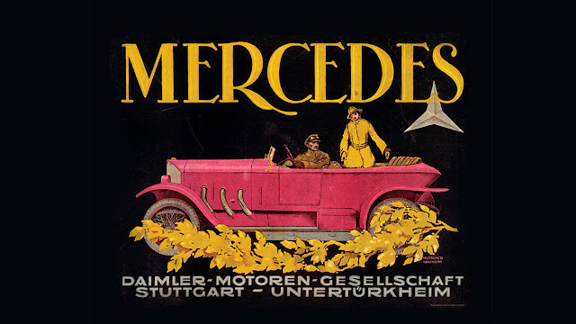
1921 posterThe first version of the iconic Mercedes three-point star appeared in 1916, with a more color for the image too. The star was designed in gold and white, on a red background with a thick circular frame. the three points of the star represented the Daimler ambition for its engines to dominate and conquer travel on land, in the air, and on the seas.
After the mergerAfter the merger of 1926 between Daimler and Benz, and then in 1933 with the rise of the Nazi party to power in Germany, Mercedes-Benz began simplifying its logo. The Mercedes image quickly became a simple, minimalistic version of the three-pointed star inside of a circular emblem.
from W121 1960 190
note how it is attached. Now plastic grommets are used rather than a nut.


.webp)


That star is more than a logo. Even small parts like emblems and trims show the brand’s heritage.
ReplyDelete